Release Notes - Kyubit Business Intelligence 3.7

Kyubit BI is moving forward with new features and improvements for OLAP analysis and Dashboards with new 3.7 release. New experience for end-users, dashboard slicer abilities, coloring your analysis cells, cell writeback feature, new kpi features, new dashboard visualizations and many more improvements. Learn about new highlights in quick video or read the following lines to discover details what is new and what is improved in the 2017 spring edition of Kyubit Business Intelligence software.


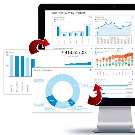
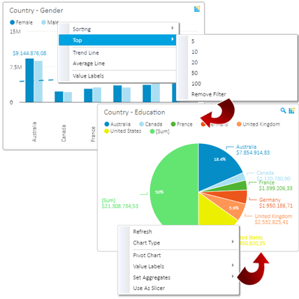
 End-user Dashboard Actions

At any time using the Dashboard, end-user can choose set of actions to additionally explore data on the chart. Some of actions available to end-user are: sorting of the data, selecting TOP x values, PIVOT chart data, change display of value labels overall or for specific series, display SUM and Average value, display Trend or Average line. All actions applied on the dashboard are also rendered within Dashboard export to PDF file.

Dashboard actions

 Use Chart as Dashboard Slicer

End-user on the dashboard can select chart to behave as slicer for other visualizations on the dashboard that are based on the same OLAP data source. Column chart, Line chart, Pie chart, Doughnut chart and TreeMap chart can be turned to slicer mode at any time to explore and analyze dashboard data by simply clicking on the chart segments. At the same time, more than one chart could be in slicer mode to filter whole dashboard in many combinations.

Dashboard slicer

 Grid Analysis KPI improvements

KPIs defined within Grid analysis, now are automatically visible in Dashboard when attached to table chart visualization. KPI status can be defined also towards other measure on the same analysis, not only to fixed values. Define cell colors and other formatting visuals for the certain KPI status.

KPI

 Cell Formatting

Cells in Grid Analysis and Dashboard could be visually formatted which includes 'Alignment', 'Text Style', 'Fore Color' and 'Background Color'. If defined on OLAP analysis grid, it will be displayed on OLAP Report and it could be conditionally rendered, depending on the status of KPI.

OLAP Analysis Formatting

 TreeMap Chart

New dashboard visualization is 'TreeMap' chart that is used to quickly gain perception of the values and its mutual proportions. There are several options to configure about 'TreeMap' behavior, such is color for 'high' and 'low' values and option to render size based on first series of values and color based on second series, separately.

Dashboard Treemap

 Cell writeback, What-If Analysis

OLAP cell writeback feature is now part of Kyubit app as well. At any time, right click the cell and change its value, if your OLAP structure allows it. Cell writeback will at first change values in session only, allowing user to play with data and explore what-if scenarios. At request, new cell values could be published back in OLAP database cube.

What-If Analysis

 Goal Meter

'Goal Meter' visualization renders KPI progress towards its goal. It is simply visualization that will tell, how much there is until KPI goal is met. Add 'Goal meter' and attach to any existing KPI to visualize its progress status.

Dashboard KPI Goal Meter

 Guage visualization, new options

'Gauge' visualization has new configuration options, that include 'Color meter on the top of the gauge', 'Different types of pointers' to select, 'Display of previous value indicator' or 'Displaying mini chart' in the middle of the chart.

Dashboard Gauge

Other new features, improvements and fixes ...

  • Grid analysis measure title height is taller and has always enough space to display whole measure title without changing the width of the measure column, wrapping text if required.
  • Set grid analysis category columns width individually without changing width of measure columns. Now, it is possible to have wide category member names with narrow measure columns on the same analysis grid.
  • Animate last point on the line chart to get attention of the end-user on animated circles that represent most recent value on the chart. Animated last value could be enabled on Line chart, KPI Mini line chart and Card visualization Mini line chart. Check on the 3.7 release video to see 'Animated last point' in action.
  • Explicitly configure which filters would be used by single tile on the dashboard. This option is useful when you would like to fine tune which dashboard filters would be accepted by the tile, in situations when tile chart is based on one data source and dashboard filters are based on another data source.
  • Query object now support SQL stored procedures to be implemented to show parametrized data on the dashboard.
  • Query objects could include 'Tag' that will group queries based on same topic. Useful, when working with large number of queries. View of the queries can be filters by the 'Tag' when managing queries or selecting as data for the tile in dashboard design view.
  • 'Search Members' feature performance is greatly improved when searching for dimension members within analysis or dashboard slicer selection.
  • Saving analysis shows folder selection dropdown list with full paths to folder with regards to its hierarchy.
  • Saving analysis suggest to save to folder that was last opened by the user. (Not 'My Analysis')
  • Simplified integration of Kyubit visualizations in other web application using DIV/Javascript approach.
  • IFRAME integration of Kyubit dashboards into other web applications, explicitly set tile height.
  • New Dashboard geo maps for 'Austria' and 'Denmark'
  • Decomposition analysis dialog on save.
  • Creating sub-folder automatically inherits permissions from the parent folder.
  • 'Open in PDF' buttons appears on the OLAP chart view.
  • FIX - Opening analysis and going back, returns user to folder from which analysis was opened.
  • FIX - Message about 'Structural changes...' after processing OLAP cube, is not displaying anymore.
  • FIX - Analysis report view, display folders path to save.
  • FIX - Renaming of folders on some envioronments results with error.
  • FIX - Grid Analysis export to Excel when values are displayed as percentage or columns or rows totals.
  • FIX - Dashboard 'Combo chart', filter was not applied to second defined query.
  • FIX - Analysis with calculated measure that includes division by zero results with error.
  • FIX - Drillthrough with link defined on custom drillthrough columns.
  • FIX - Decomposition analysis changing chart to 'Table' and back results with UI inconsistency problems.
  • FIX - When using non English user interface, problem with dashboard filters for which current user does not have permissions in OLAP database.
  • FIX - Enabled and disabling 'Visible series' in OLAP chart analysis.
  • FIX - Analysis subscription to Excel file included fixed name of the file 'Test.xlsx'. Now, includes analysis actual name.
  • FIX - Published analysis has 'published' mark on the list, even if publishing is revoked.
  • FIX - 'Specific series' on dashboard tiles, not working as expected in some situations.
  • FIX - Creating of sub-folder allowed only to user with Read-only permissions in the folder.
  • FIX - Folder cannot be deleted, if it contains sub-folders.
  • Fix - Changing details of the 'Named set' from the 'Shared OLAP Items' list.
  • Fix - Measure Name was missing on the chart within OLAP Report.
  • Fix - When 'Dashboards' application section is configured in web.config not to appear in application usage, there were situations when it still have been displayed.
  • Fix - Published analysis filters do not work as expected using 'Firefox'.

Stay tuned for more news from Kyubit and send us your feedback!