|
New Features
|
| |

|
|
ODBC data source support for SQL queries
|
| |
|
It is possible to define ODBC data sources and make SQL queries in Kyubit BI against various data sources as well!
For example, you can display visualizations to your team on data that is based on Excel, Access, Oracle, My SQL and other data sources!
|
|
|
| |
|
|
|
Simplified URL Routes to BI content
|
| |
|
Access created analyses, dashboard and other application sections over URL routes like http://yoursite/analysis/123 or http://yoursite/dashboard/123.
Old URL routing to created content (For example, http://yoursite/Forms/Analysis.aspx?AnalysisId=123) is also available as well.
|
|
|
| |
|
|
|
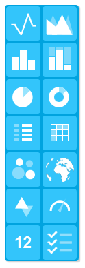
12 new dashboard visualizations
|
| |
|
New version includes new dashboard visualizations that you can quickly use on dashboard to present your data. Bubble chart, Area chart, Area stack chart, Area
100% chart, Column stack chart, Column 100% chart, Doughnut chart, Scorecard, Card, Small Card, Combo chart and Table.
|
|
|
| |
|
|
|
OLAP 'Peek Analysis'
|
| |
|
'Peek Analysis' enables you to make a quick 'Sub-analysis' of some cell in 'Parent' analysis, that gives insight about particular cell without losing data of 'Parent' analysis
on the screen. By default, dimension used for 'Peek analysis' is Time dimension in current cube, but this could also be modified by the user, as well as dimension for series.
Great feature for data exploration.
|
|
|
| |
|
|
|
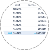
Aggregate operation per measure in OLAP analysis
|
| |
|
For each individual measure added to OLAP analysis, define which aggregate operation will appear.
If aggregate operation is not defined on the measure, aggregate operation defined in 'User settings' will be applied by default.
|
|
|
| |
|
|
|
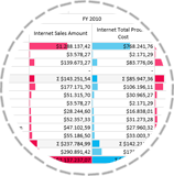
'Value bars' on OLAP report and Dashboard table visualization
|
| |
|
'Value bars' indicator quickly shows impact of the value in current cell compared to column totals or grand totals.
Option to display 'Value bars' in OLAP report and new dashboard visualization 'Table'.
|
|
|
| |
|
|
|
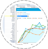
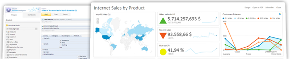
'Table', dashboard visualization
|
| |
|
'Table' visualization displays all data or query and analysis with multiple rows and columns and optionally scrollbars. User can decide height of the 'Table' visualization on
the dashboard and display of 'Value bars'.
|
|
|
| |
|
|
|
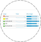
Scorecards
|
| |
|
Group related KPIs to Scorecard and visualize them together on a same dashboard visualization as a list of KPIs with its indicators, line charts and Target indicators.
|
|
|
| |
|
|
|
'Cube structure' picker
|
| |
|
While selecting dimensions and levels in OLAP chart analysis or Dashboard filtering, instead of menus with OLAP structure, now 'OLAP structure' picker
is available, that is more convenient to select appropriate OLAP dimension level.
|
|
|
| |
|
|
|
OLAP report, switch Grid/Chart combination and 'Value bars' by the user looking at the report
|
| |
|
Up till now, only user who created the OLAP analysis could decide about Grid/Chart combination on the report. Now, user can change display for the time of his
observation, as well as 'Value bar' indicators, which could be set to 'Compare Totals' or 'Compare Grand Total'.
|
|
|
| |
|
|
|
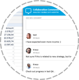
Collaboration comments
|
| |
|
New application feature that enables team discussions on a particular analysis, dashboard or application level.
If 'Notification' is enabled, user can receive emails related to new comments added.
Each user can add his picture in 'User settings' that will be visible in collaboration comments.
Collaboration commenting could be disabled.
|
|
|
| |
|
|
|
Notifications
|
| |
|
Notification is enabled by the user on the 'Folder'. When adding new analysis, dashboard and collaboration comments related to same folder, send
email to the user about action taken with option to immediately open same content.
|
|
|
| |
|
|
|
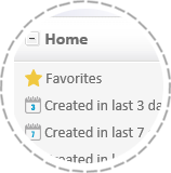
Favorites
|
| |
|
Mark interesting analyses and dashboard as favorite. Favorite items appear on the Home screen.
|
|
|
| |
|
|
|
Home screen
|
| |
|
First application section visible after opening application is Home screen, that displays Favorites, Collaboration comments and created objects in last 3, 7 and 14 days.
|
|
|
| |
|
|
|
Activity Log
|
| |
|
Administrators could use 'Activity Log' to search and list all actions taken by any user or any object within Kyubit Business Intelligence application for defined
period of time. 'Activity Log' presents total insight in application usage / utilization and could be exported to Excel file.
|
|
|
| |
|
|
|
Dashboard SQL query slicers
|
| |
|
Dashboard elements based on SQL query data can also be filtered and sliced in new release of Kyubit BI.
Somewhat basic SQL query knowledge is required to construct queries that can take 'Input Parameters'.
Queries with 'Input Parameters' can be filtered within dashboard using text and date inputs or collection of values from another query.
|
|
|
| |
|
|
|
User can select visualization type on the dashboard tile
|
| |
|
Visualization on the dashboard tile is defined in dashboard design time, but now, end-users of the dashboard can temporarily change tile visualization type to best match their current analysis request.
Also, while doing analysis on a particular time (like Drill-down) user has option to select visualization other than Pie chart.
|
|
|
| |
|
|
|
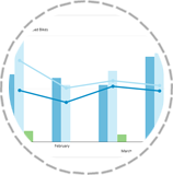
Combo chart, dashboard visualization
|
| |
|
Compare two data sets (queries or analysis) on the same chart on the dashboard. First set is 'Line chart' while other could be 'Column chart' or 'Line chart' as well.
Both data sets can use same value axis or each set could be displayed on a separate axis scale.
|
|
|
| |
|
|
|
Exclude tile from filtering/slicing
|
| |
|
All tiles on the dashboard by default accepts filter inputs defined on the dashboard automatically, but now, user has option to exclude tile from dashboard filtering.
|
|
|
| |
|
|
|
SQL query column format string
|
| |
|
When defining SQL queries, new option is to define number format output for each returned column. So far, it was possible to set measure units displayed after number returned by the sql query, but format output has much better formatting possibilities.
For example, format "$#,#.#0" would return $123,456.78. In other words, find tune format with regards to thousands separator, decimal sign and position of the measure unit.
|
|
|
| |
|
|
|
OLAP Analysis 'Options'
|
| |
|
'Options' menu was previously visible, if you right click on the empty surface on the grid analysis. It seems that this behavior was not much intuitive, so now there is
a button 'Options' always visible in the OLAP grid analysis, which displays general options what you can to within analysis.
|
|
|
| |
|
|
|
Custom Min and Max value for Line chart in Dashboards
|
| |
|
Min and Max values could be explicitly set on Line chart for the Dashboards to precisely display range of values based on your current reporting request.
|
|
|
| |
|
|
|
Fixes and improvements
|
| |
|
- Improvements for Drillthrough and Named set behavior.
- Named set definition within Kyubit BI that contains quote is now working as well.
- Tile legend displays three rows of values (if there are many items) and text is not broken as in some previous cases.
|
|
|
| |
|
|
|
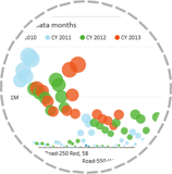
Bubble chart, dashboard visualization
|
| |
|
If OLAP analysis is based on two measures, it is ideal to display with 'Bubble chart' that will visualize both measures.
First measure will be visualized by the bubble position, while other measure will be visualized by the bubble size.
|
|
|
| |
|
|
|
Slice visualizations based on MDX queries
|
| |
|
If dashboard visualization is based on MDX query, it can also be sliced with dashboard filters!
Write any MDX query, display it with any dashboard visualization and then later, any user can use his own dashboard filters to explore and analyze dashboard data to his current interests.
|
|
|
| |
|
|
|
Support for Action URL defined for OLAP dimension members in the cube
|
| |
|
If Action URL is defined in OLAP cube for dimension level, when right click on its members in grid view, will display defined Action URL options.
|
|
|
| |